

Tableau dumbbell charts, also known as DNA charts, are an alternative visualization choice for illustrating the change between two data points. Dumbbell charts get their slang name from their appearance, which look similar to weights, and sometimes strands of DNA when they are in a horizontal orientation.
I personally love that there is an outside-the-box chart type that isn’t named after a delicious food such as donuts or waffles. You may even say that dumbbell charts are a healthy alternative!
Names aside, this is another chart type that I find to be engaging, effective, and relatively easy to create in Tableau. This tutorial will illustrate how to make a dumbbell chart in Tableau in just a few steps.
Tableau dumbbell charts are actually dual-axis combination charts, where one of the axes have a mark type of circle and the other has a mark type of line. If you are unfamiliar with using two axes in Tableau, it may be helpful to read my post on my blog on dual-axis combination charts before reading further.
How to Make Dumbbell Charts in Tableau
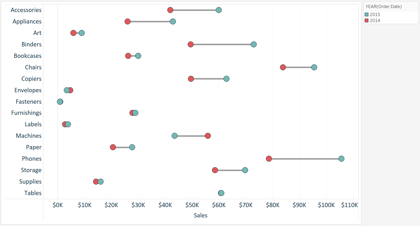
For this tutorial, we will recreate this visualization which compares the year-over-year sales per sub-category in the sample Superstore data set.
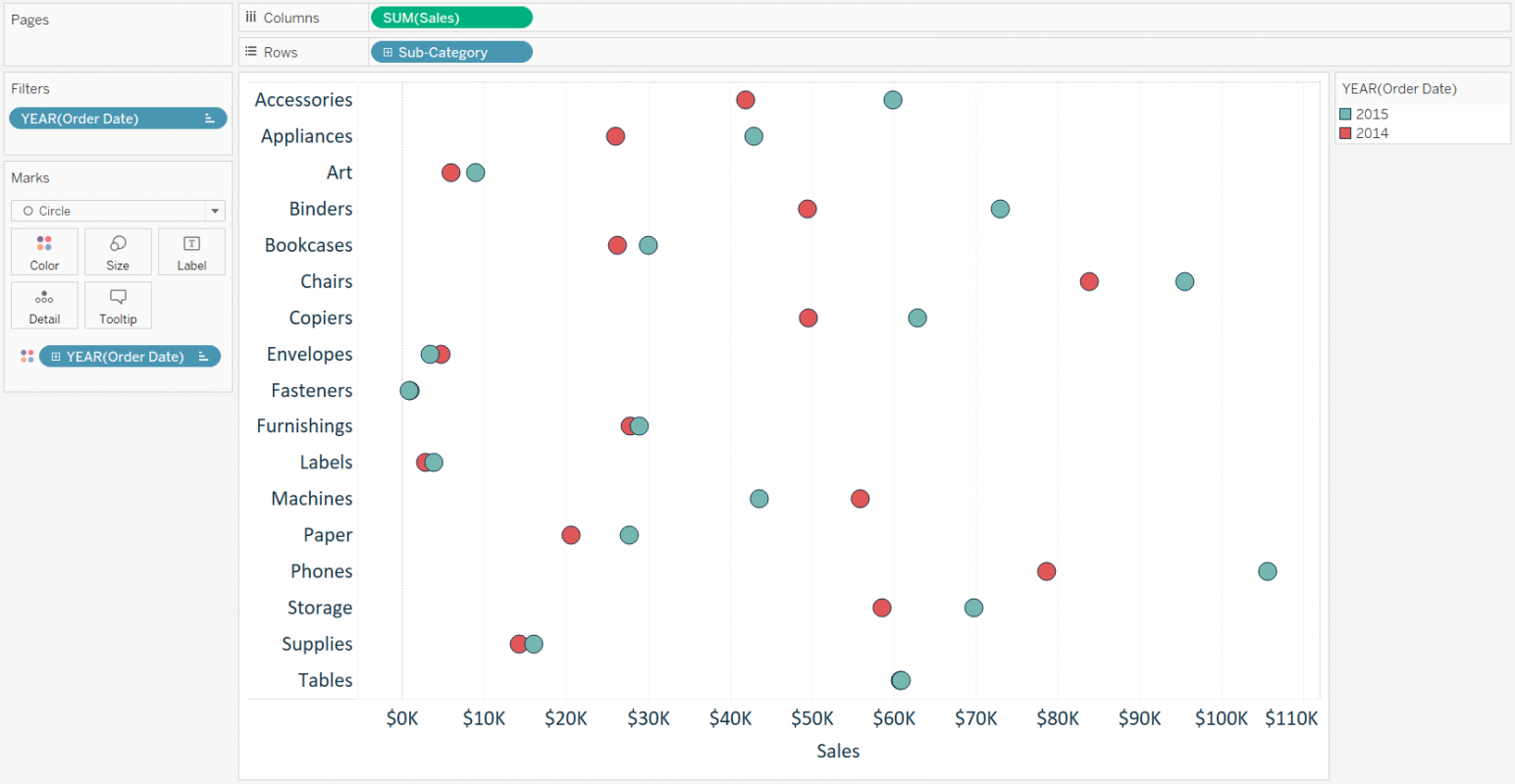
The first step to creating a dumbbell chart in Tableau is to create a dot plot with the measure and dimension you want to visualize. In this example, I will place the Sales measure from the sample Superstore data set onto the Columns shelf and the Sub-Category dimension onto the Rows shelf. This creates a bar chart showing sales by sub-category. You can easily convert the chart to a dot plot by changing the mark type from automatic to circle.
I will also filter the visualization to the last two years in the data set so that I have only two comparison points per sub-category, and also color the marks by year to distinguish which year is which. At this point, my view looks like this:
Note that this chart type can also be created with a vertical orientation by swapping the location of the fields on the Rows and Columns shelves, but we will stick with the horizontal orientation for this tutorial.
The second, and actually final, step is to create a second axis with the Sales measure and change its mark type to line. To turn this dot plot into a dual-axis combination chart, drag the Sales measure near the top of the chart directly across from the Sales axis on the bottom of the chart. When a dashed line appears, drop the measure on the view.
Alternatively, you can place a second occurrence of the Sales measure onto the Columns shelf, right-click on the second pill, and choose “dual axis." Ensure the axes always line up by right-clicking on the top axis and choosing “synchronize axis."
At this point, you have two sets of Marks cards (one for each occurrence of the Sales measure), and they can be edited independently. Navigate to the second set of Marks cards, change the mark type to line, then drag the YEAR(Order Date) dimension on the Marks shelf to the Path Marks card.
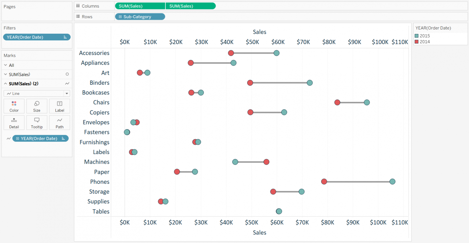
That’s all it takes to get to a nice-looking dumbbell chart in Tableau. From here, you can format the size and color of the marks and hide the top axis by right-clicking on it and deselecting “show header."

27 t/m 29 oktober 2025Praktische driedaagse workshop met internationaal gerenommeerde trainer Lawrence Corr over het modelleren Datawarehouse / BI systemen op basis van dimensioneel modelleren. De workshop wordt ondersteund met vele oefeningen en pra...
29 en 30 oktober 2025 Deze 2-daagse cursus is ontworpen om dataprofessionals te voorzien van de kennis en praktische vaardigheden die nodig zijn om Knowledge Graphs en Large Language Models (LLM's) te integreren in hun workflows voor datamodel...
3 t/m 5 november 2025Praktische workshop met internationaal gerenommeerde spreker Alec Sharp over het modelleren met Entity-Relationship vanuit business perspectief. De workshop wordt ondersteund met praktijkvoorbeelden en duidelijke, herbruikbare ri...
11 en 12 november 2025 Organisaties hebben behoefte aan data science, selfservice BI, embedded BI, edge analytics en klantgedreven BI. Vaak is het dan ook tijd voor een nieuwe, toekomstbestendige data-architectuur. Dit tweedaagse seminar geeft antwoo...
17 t/m 19 november 2025 De DAMA DMBoK2 beschrijft 11 disciplines van Data Management, waarbij Data Governance centraal staat. De Certified Data Management Professional (CDMP) certificatie biedt een traject voor het inleidende niveau (Associate) tot...
25 en 26 november 2025 Worstelt u met de implementatie van data governance of de afstemming tussen teams? Deze baanbrekende workshop introduceert de Data Governance Sprint - een efficiënte, gestructureerde aanpak om uw initiatieven op het...
26 november 2025 Workshop met BPM-specialist Christian Gijsels over AI-Gedreven Business Analyse met ChatGPT. Kunstmatige Intelligentie, ongetwijfeld een van de meest baanbrekende technologieën tot nu toe, opent nieuwe deuren voor analisten met ...
8 t/m 10 juni 2026Praktische driedaagse workshop met internationaal gerenommeerde spreker Alec Sharp over herkennen, beschrijven en ontwerpen van business processen. De workshop wordt ondersteund met praktijkvoorbeelden en duidelijke, herbruikbare ri...
Deel dit bericht